 This is my second attempt at using in design to produce a double page spread.
 Tuesday, 18 December 2012
In Design: Isle of wight double spread
This is my second attempt at using in design to produce a double page spread. Thursday, 13 December 2012

Tuesday, 27 November 2012
CD Cover - Skills Development

Here I have used different brushes in order to create the effect of the lines down the cover as well as the shape creation tool to get the shape of the love heart.
Thursday, 15 November 2012
Load Selection Tutorial And Evaluation
Load Selection Tutorial And Evaluation

In order to create this piece of text and the way it looks I used several tools in photoshop. I created the text then modified and expanded the text, then added effects such as a Bevel, to give it a 3D look, a shadow to make the text look even more immersive and i used the colour filler tool to fill in the space within the letter A.

In order to create this piece of text and the way it looks I used several tools in photoshop. I created the text then modified and expanded the text, then added effects such as a Bevel, to give it a 3D look, a shadow to make the text look even more immersive and i used the colour filler tool to fill in the space within the letter A.
Composition Images Evaluation

Composition Image Evaluation
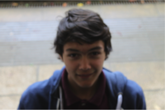
Extreme Close Up
Shot:
This shot is an extreme close up shot; this has connotations
of feelings and emotions.
This shot was taken using manual focus; this enabled us to
get the right amount of focus, however I think this photo could be slightly
more in focus. We did not use zoom for this because
Tilt Shot:
This shot is a tilt shot, the camera is looking down on the
subject, making him look venerable and weak.
This shot is slightly out of focus, to take this I used
manual focus.
To improve this shot I could use manual focus more in order to produce a more in focus image.

This is a long shot, a long shot would normally be used in order to introduce a person and their surroundings.
To improve this image I could place the subject in a more central position as this subject is slightly to the left.

This is a medium close-up shot. You would use this image to see the background as well as the subjects facial expressions.
This is a well composed photo, the subject is in the centre of the frame, his eye-line is above the rule of thirds and the image is in focus.
Improve this image I could create a lighter image perhaps with artificial light or changing the ISE settings on the camera.

This is a closed frame shot. These are usually used in order to draw focus upon the subject, the subject is in the centre of the image, above the rule of thirds and the image is well focuses.
If taking another closed frame shot I could look into being more creative, perhaps just close framing his eyes for dramatic effect.
If taking another closed frame shot I could look into being more creative, perhaps just close framing his eyes for dramatic effect.
Shutter Speed Evaluation
Shutter Speed Image Evaluation
I used Shutter speed so I can capture an image that is moving fast. I changed the presets according to the speed the subject of the image is moving at. The camera I used ranged from 1/4000 sec to 30 secs.

For this image I have chosen to a shutter speed of 1/2000.
I used this speed in order to freeze frame the image, because a bike goes faster than a person I needed the shutter speed to be faster than a person can normally see. As you can see the lighting is not brilliant due to outdoor conditions, to improve this in future I would change the ISO settings on the camera, allowing more light to come through the camera, or alternatively use artificial lighting.

For this image I have chosen to use a shutter speed of 1/4000.
This is a very similar image to the first image. I used a higher shutter speed setting because the car was going slightly faster.
To improve this image change the ISO settings on the camera, allowing more light to come through the camera, or alternatively use artificial lighting.

For this image I used a shutter speed of 1/250 of a second. This image features running water, I used this shutter speed to capture the water in a freeze frame while running.
This image is slightly dark, to improve this I could again either use artificial lighting or change the ISO settings on the Camera.

For this image I chose use a 4 second shutter speed. I used this to capture the moving light of the torch. This allowed me to create the effect you can see, the light has followed a pattern and left a trail.
Friday, 26 October 2012
A Short Informal Paragraph About Alcohol Addiction:
NOW THEN! I was proper wrecked the other day like. Do you get wrecked like? Of course ya do.
I need to stop peeving like, ruining me life it is, spewed all over the boozer. Got shot out I did, HaHa!
Bouncer rived me about everywhere and shot me out he did. That ever happen to you? Its proper shite aint it.
- I have used informal language in this paragraph...
A Short Formal Paragraph About Alcohol Addiction:
Went to the pub the other night, Unfortunately had too much to drink. I hate it when this happens, I need to stop going out and drinking. I feel its having a negative impact on my life, I was sick allover the pub. This then caused the security staff to escort me from the premises.
- I have used formal language in this paragraph...
Thursday, 25 October 2012
Photoshop Vampire Tutorial
Vampire Tutorial Photoshop

 This is the image after I have edited it in order to transform the woman into a vampire.
To create this effect I used the Sponge, Burn and Magnetic Lasso tools.
First I used to Sponge tool to make the skin a grey colour, this gives the effect that the woman is cold and dead because these are the connotations that the colour grey has.
After this I then used the burn tool to create dark eyes and create a darker area around the eyes. I then used the tool to make the lips stand out more as they are a brighter shade of red.
To create the vampire teeth I used the Magnetic Lasso tool, then selected copy via layer and used the warp transformation. I then pulled the teeth down to create pointed vampire looking teeth.
After creating the teeth I put a blood splatter effect on her left cheek, to use this i downloaded some brushes and changed the size and orientation to create this effect.

This is the original image before I edited it.

To create this effect I used the Sponge, Burn and Magnetic Lasso tools.
First I used to Sponge tool to make the skin a grey colour, this gives the effect that the woman is cold and dead because these are the connotations that the colour grey has.
After this I then used the burn tool to create dark eyes and create a darker area around the eyes. I then used the tool to make the lips stand out more as they are a brighter shade of red.
To create the vampire teeth I used the Magnetic Lasso tool, then selected copy via layer and used the warp transformation. I then pulled the teeth down to create pointed vampire looking teeth.
After creating the teeth I put a blood splatter effect on her left cheek, to use this i downloaded some brushes and changed the size and orientation to create this effect.
Tuesday, 23 October 2012
Introduction Prompts
Introduction Prompts
1.
SHOCK
INTRODCTION
(http://www.dailymail.co.uk/home/you/article-1020459/Alcohol-wrecked-life.html)
Alcohol Ruined Their Lives! Six women talk candidly about
their experiences with alcohol abuse. Husbands lost, children taken into care,
abused by parents, near death experiences and brushes with the law. The number of women drinking at harmful
levels has increased by 50% in the past 20 years. We talk to some of those
effected by this problem.
2. QUESTION
INTRODUCTION
(http://www.huffingtonpost.co.uk/2011/12/30/alcohol-and-stis-nhs-missing-key-opportunities-to-educate-young_n_1175895.html)
Are the NHS missing vital Opportunities to educate young
people about the dangers of alcohol abuse? 1.5 million young people pass
through NHS sexual health clinics each year, according to experts these are
ideal opportunities to further educate young people about alcohol abuse. We
take a look at the facts and figures and investigate weather the NHS could be
doing more to combat alcohol problems that younger people face.
Thursday, 18 October 2012
Photoshop - Spot Healing Brush Tool:
 Before:
This is the original image before I used the spot healing brush tool. as you can see there are a lot of red spots on the face as well as red patches of skin.
 After
After
I used the Spot Healing Brush tool to brush out the red spots and red patches of skin, as you can see there has been an improvement in the condition of the skin and the patchy red areas of skin.
For his task I used the spot heal tool brush and clicked alt to the the skin tone similar and changed the brush size depending on the size of the spots, and as I went round her face i selected different samples of skin in order to keep the skin tones a similar colour. I used duplicate layers and selected all layers, this enabled me to correct mistakes without erasing all the work I had already done.
All layers, duplicate layers
To Improve I would use the Spot Healing Brush further in order to make the skin a more white colour rather than have the red patches of skin, they were hard to get rid of because of the amount of them on the face.

This is the original image before I used the spot healing brush tool. as you can see there are a lot of red spots on the face as well as red patches of skin.

I used the Spot Healing Brush tool to brush out the red spots and red patches of skin, as you can see there has been an improvement in the condition of the skin and the patchy red areas of skin.
For his task I used the spot heal tool brush and clicked alt to the the skin tone similar and changed the brush size depending on the size of the spots, and as I went round her face i selected different samples of skin in order to keep the skin tones a similar colour. I used duplicate layers and selected all layers, this enabled me to correct mistakes without erasing all the work I had already done.
All layers, duplicate layers
To Improve I would use the Spot Healing Brush further in order to make the skin a more white colour rather than have the red patches of skin, they were hard to get rid of because of the amount of them on the face.
Thursday, 27 September 2012

Induction Project Evaluation:
If I was to do this project again I would take several more photos rather than the two images that I took, this would allow me to choose from a larger range of images rather than the two I had to choose from, this would put me in a position to use a better image on my magazine cover.
Here are the two images which I took to produce my front cover:

As you can see this image is landscape, this is not practical when creating a magazine front cover. This is the main reason in which I chose not to include this image in my initial project.

This is the image that I chose to use for my magazine front cover, I chose it because it is portrait and that is suitable for a magazine front cover. Having a portait image allows me to place all my sell lines titles and other elements of the front cover easily around the main image.
I think that this magazine conforms to conventional magazine styles in a way that it has a similar layout to music magazines that are actually on sale today.
I would also learn to use the diferent features of a camera. I used autofocus to take all of these photos. When taking photos again for future assignments I will use specific settings and manual focus to improve.
The tools I used in photoshop were limited, this is an area for improvement as I think that by using more tools and by using them with greater effect.
I downloaded a font from DaFont.com to use on my magazine cover, this was a useful tool as it allowed me to use a font that I beleive suited the magazine as it coresponded to the genre.
I used a colour scheme that is conventional in magazines of the music genre. Colours such as Red, White, Black and Grey.
I used Liam Gallagher as a main feature in this magazine as he is a massive name within the music industry and will draw interest from the target audience of this magazine.
I think this magazine is a good first attempt at creating a magazine front cover. The layout conforms to conventions set in similar magazines, the colour scheme will appeal to the target audience. I think that in future when creating similar magazine front covers I will take a photo that makes it easier to position sell lines around as I think this cover looks a bit crowded in terms of textual content on the front cover.
Thursday, 20 September 2012

Tuesday, 18 September 2012
Print Skills Audit - 18.9.12
AS Media Production: Technical Skills Audit Print Production
Name: Jack Price Tutor group: Date: 17.9.2012
Photographic Skills
Which of the following photographic features/equipment have you used on a camera before:
Feature
|
Yes
|
No
|
Comments if yes – where have you completed this skills and to what level
|
Manual Focus features
|
No
| ||
Shutter Speed
|
No
| ||
Aperture control
|
No
| ||
A tripod
|
No
| ||
External flash
|
No
| ||
Self timer facility
|
No
| ||
Light meter
|
No
| ||
Composition grids
|
No
|
Photoshop Skills
Which of the following features of Photoshop have you used before:
Feature
|
Yes
|
No
|
Comments if yes – where have you completed this skills and to what level
|
Have you ever used Photoshop ever before?
|
NO
| ||
Text control
|
NO
| ||
Filters
|
NO
| ||
Brushes
|
NO
| ||
Layers
|
NO
| ||
Opacity control
|
NO
| ||
Shape creation
|
NO
| ||
Brightness and contrast control
|
NO
| ||
Dodge/Burn
|
NO
| ||
Clone stamp tool
|
NO
| ||
Colour curves adjustment
|
NO
| ||
Resolution setting control
|
NO
| ||
Magnetic lasso, polygon lasso tool
|
NO
| ||
Cropping tool
|
NO
| ||
Retouch tool
|
NO
|
In Design Skills
Which of the following features of In Design have you used before:
Feature
|
Yes
|
No
|
Comments if yes – where have you completed this skills and to what level
|
Have you ever used In design ever before?
|
NO
| ||
Margin and column guide creation
|
NO
| ||
Inserting text in ID
|
NO
| ||
Inserting images in ID
|
NO
| ||
Resizing images in ID
|
NO
| ||
Text manipulation – resizing, rotation
|
NO
| ||
Text manipulation – controlling kerning and leading
|
NO
| ||
Text flow creation
|
NO
| ||
Text effects – drop shadow
|
NO
| ||
Drop cap insert
|
NO
| ||
Using transparent imagery in ID
|
NO
| ||
Shape creation In design
|
NO
| ||
Text wrapping
|
NO
| ||
Exporting to PDF from In-design
|
NO
|
Subscribe to:
Comments (Atom)